ENDURING LOVE FOR ARCHITECTURAL
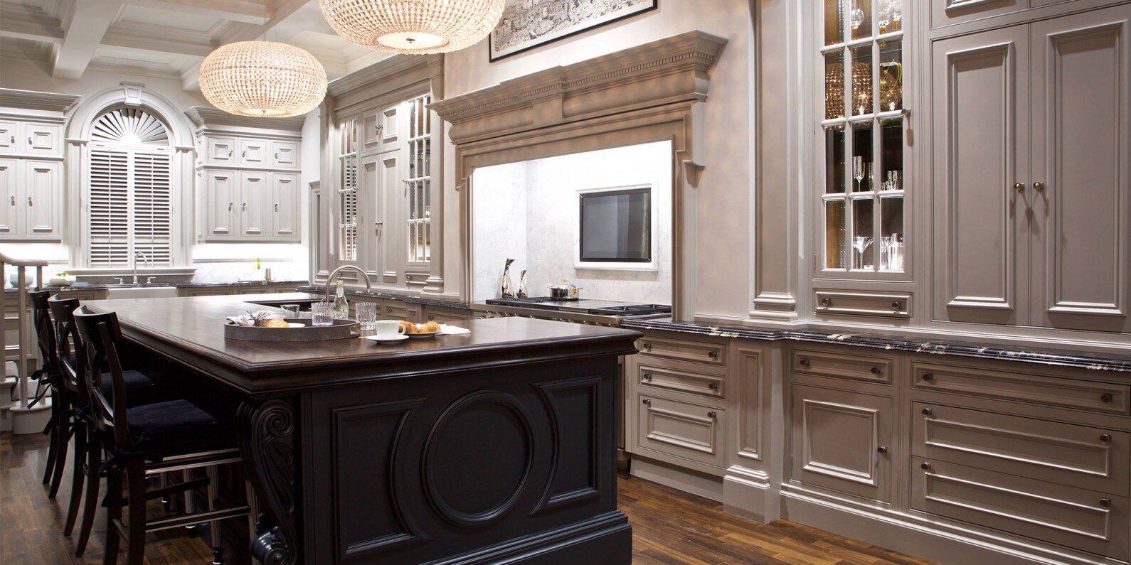
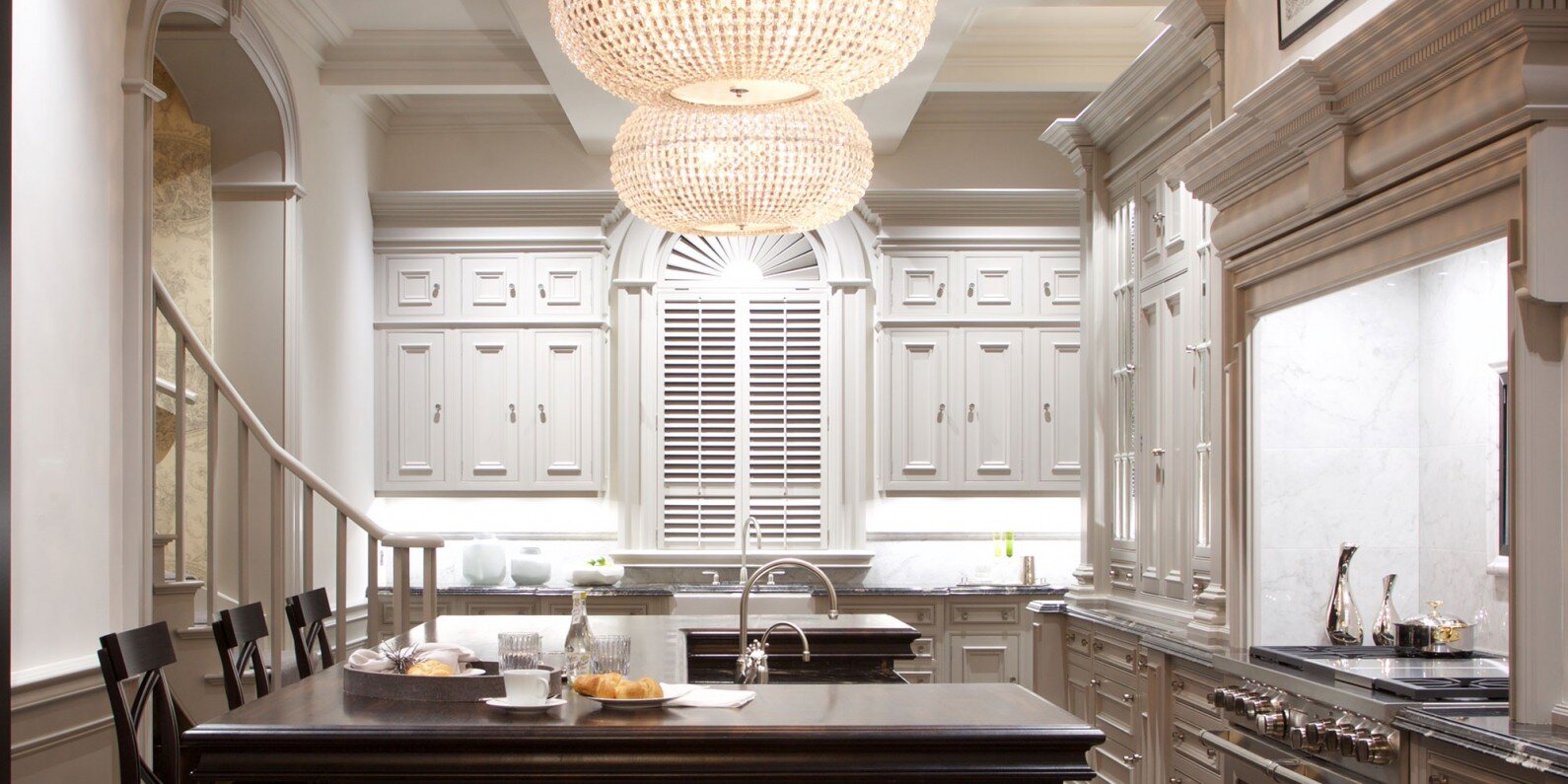
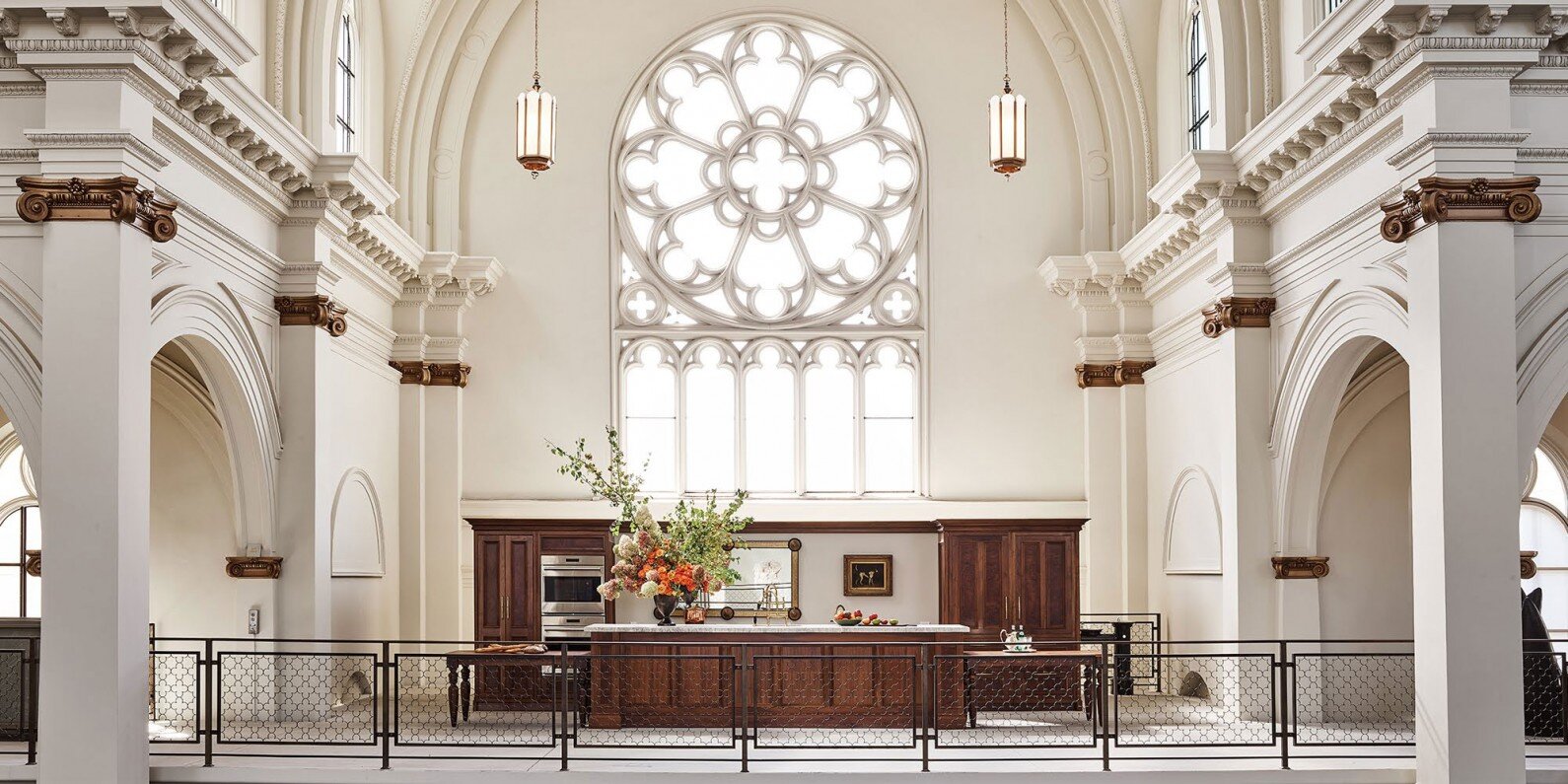
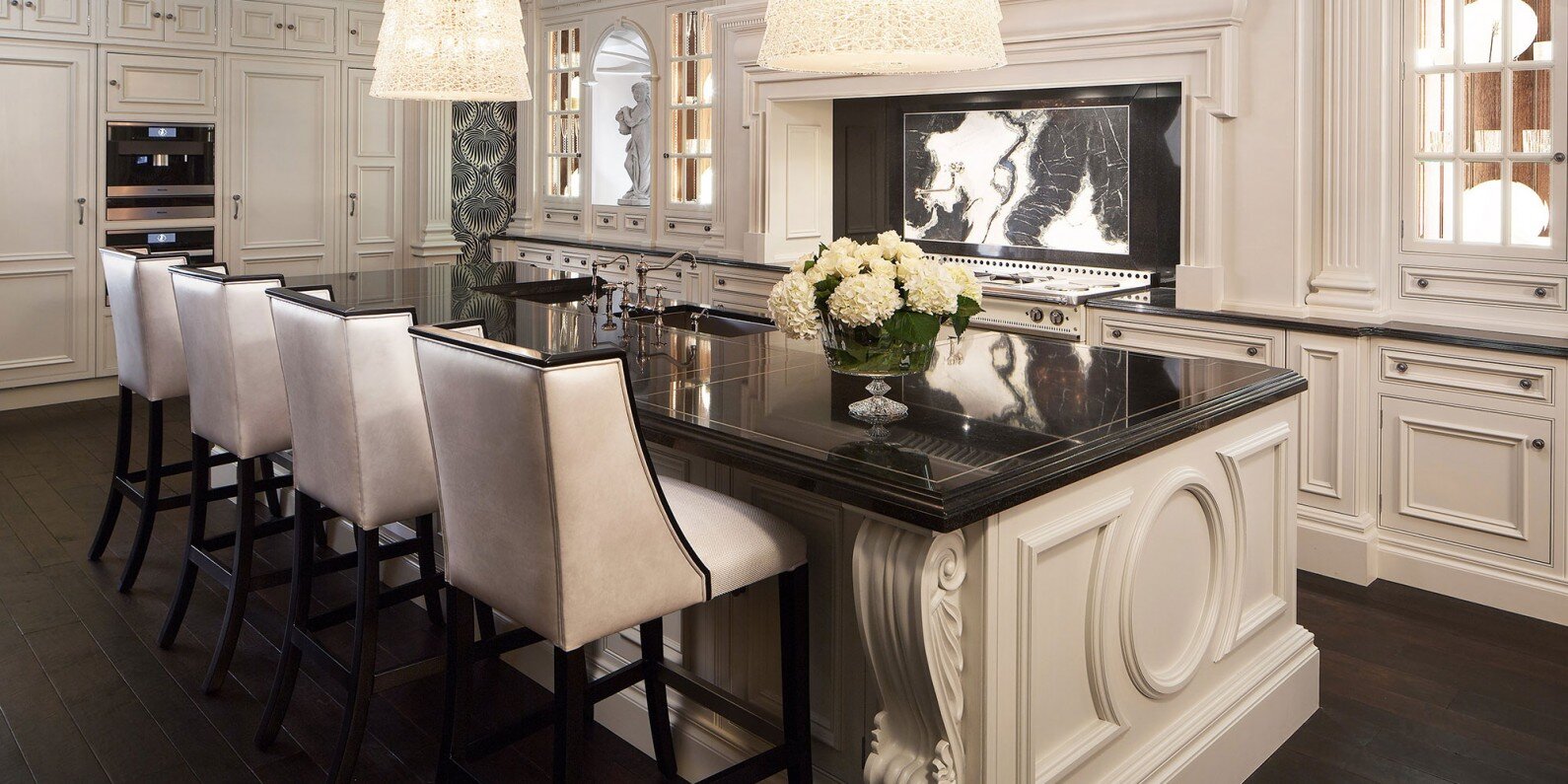
When you picture a Clive Christian Furniture kitchen, the first image that springs to mind is likely to be the classical Architectural collection. It is the style responsible for putting the company on the map, and today it remains our most popular kitchen by a considerable margin.
When Clive Christian Furniture launched its first statement kitchen in the 1990s, it rocked the world of interior design. The Victorian range was luxurious, decadent and opulent, something never seen before in the world of kitchens which to that point had principally been functional rooms. An unparalleled success, clients fell in love with the lavish styling. The luxury kitchen became a sought-after commodity, and the demand for grandeur increased.
Recognising the need for evolution, the business redesigned its flagship Nantwich showroom creating a spectacular space to showcase the next level of luxury kitchen, and the Architectural range was born.
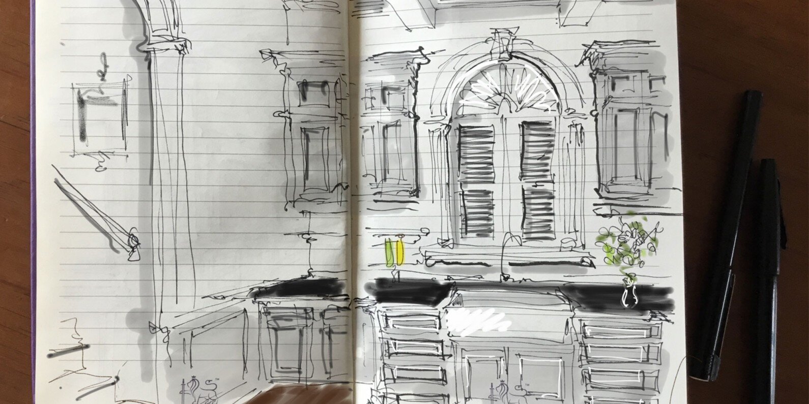
David Dunkley, Clive Christian Furniture’s then Design Director takes up the story “Our clients wanted a statement kitchen, and it’s very difficult to make a real statement with modern furniture. I have always loved classical architecture. At school I was awarded The Observer’s Book of Architecture as a prize, and this was the first book I picked up for inspiration.”
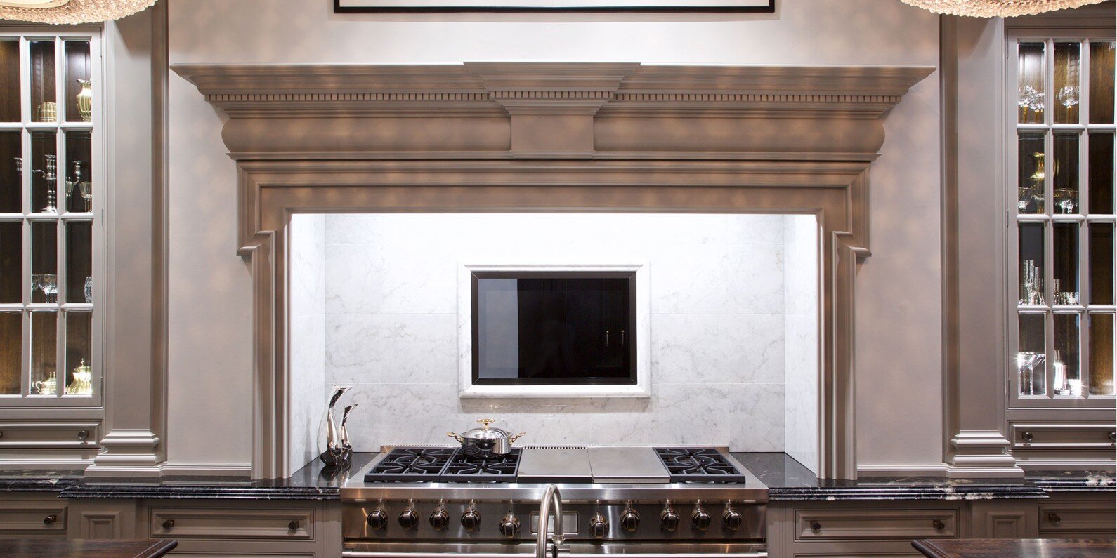
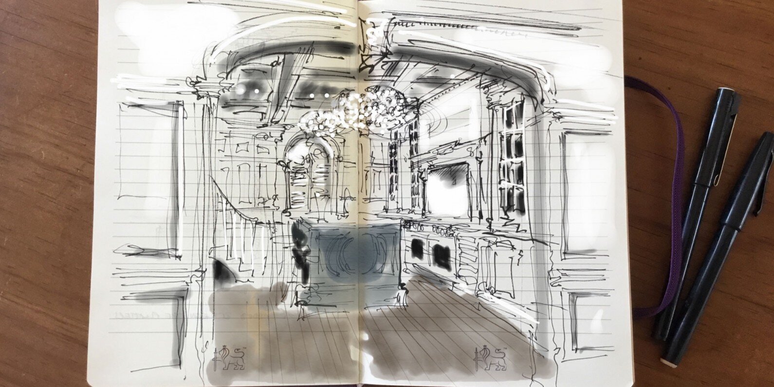
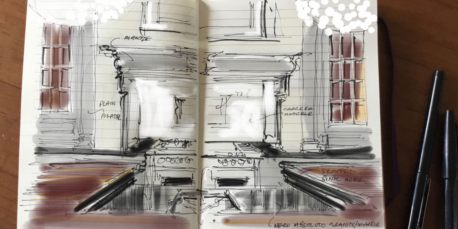
“In Nantwich, we had such a significant space to play with so we just decided to throw everything at it!” David continues. “I included all the principal elements of classical architecture – a mantle, cornices, friezes, pilasters, plinths …. and every feature was meticulously designed to be architecturally correct and in proportion.”
The most significant and striking feature of the Architectural kitchen is the dramatic, over-sized island, topped by two magnificent chandeliers. No other company had previously had the vision or bravery to introduce such elements, and they have subsequently become the signature of Clive Christian Furniture.
Another critical component is the mantle. It marks the centre point of the room, and the size of the mantle dictates the proportions of the rest of the scheme.
David continues ”Scale and proportion are critical. There are so many elements to this collection, but the fact that they are all proportionate and true to classical principles means they all work together.”
The Architectural kitchen was an instant success. Grand, opulent and characterful, it signified another milestone in the world of kitchens for Clive Christian Furniture.
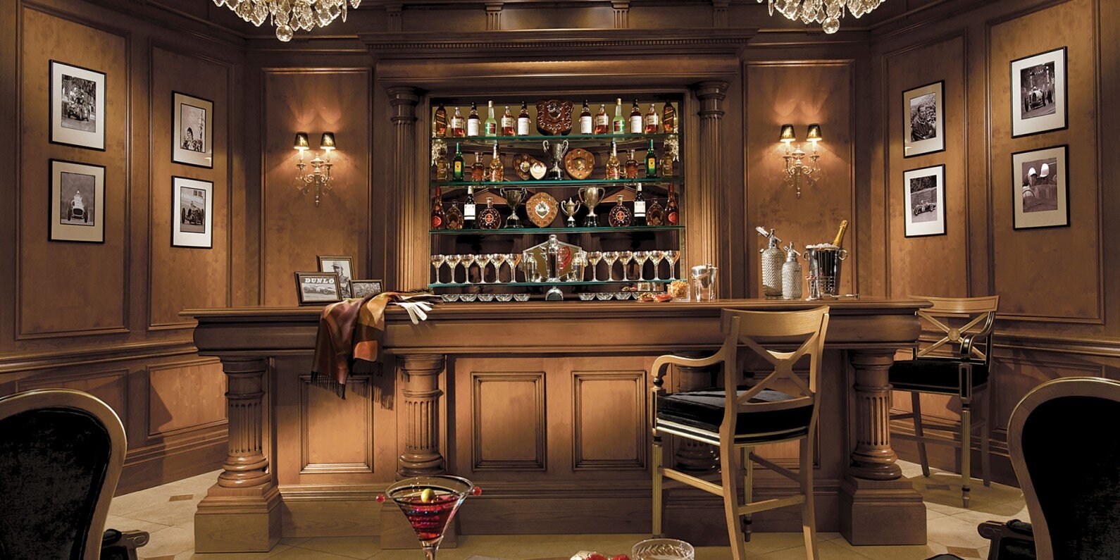
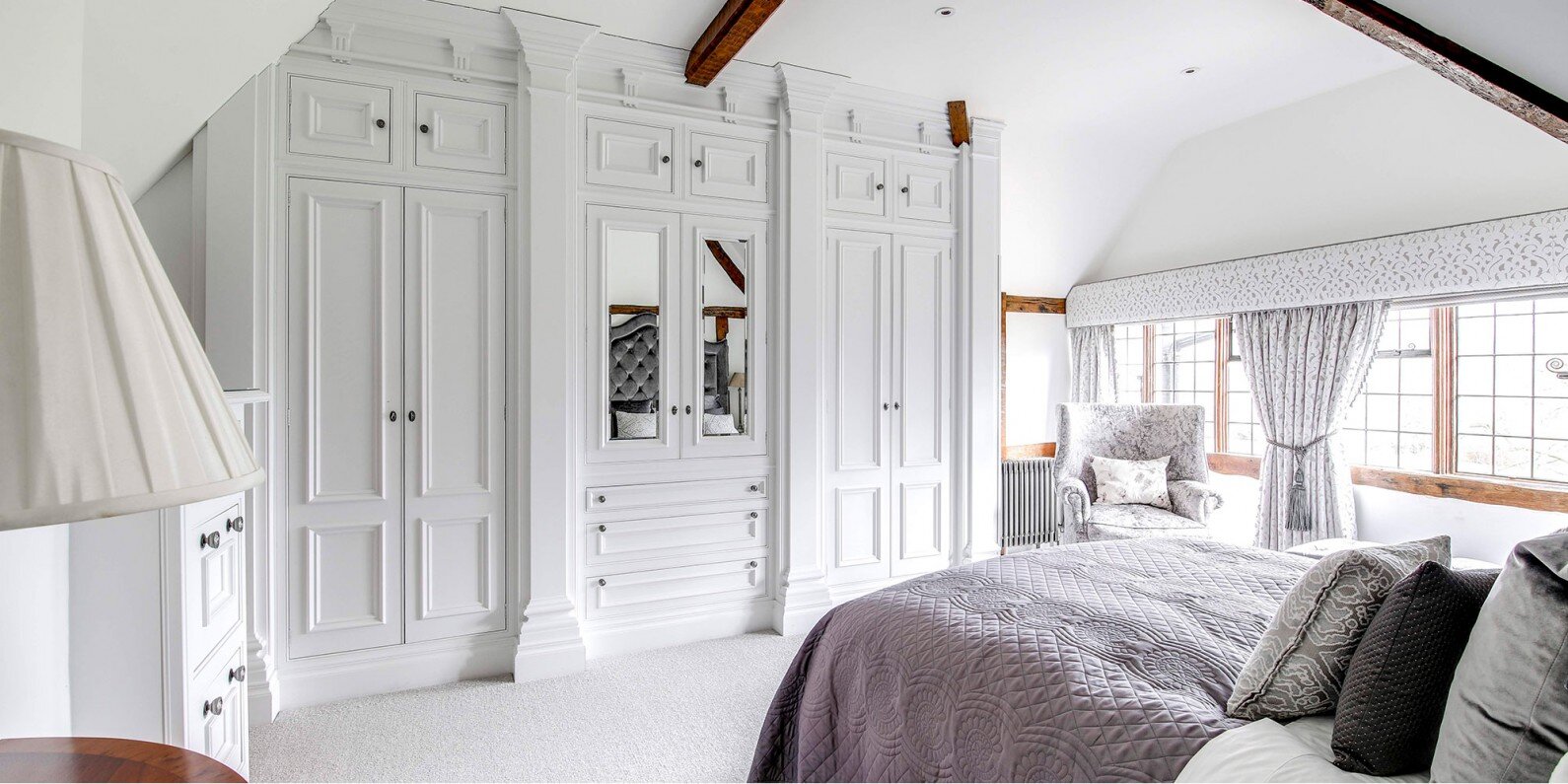
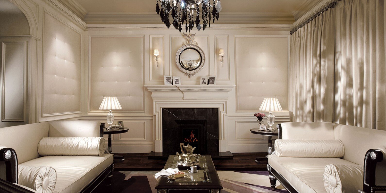
Still the company’s most popular collection, the Architectural range has moved beyond the kitchen into the rest of the house. Dressing rooms, bedrooms, home studies, games rooms, libraries … all lend themselves to a classical Architectural style.
So how has the collection changed?
Like classical architecture, the Architectural range is timeless. Trends can be reflected through the use of colour, lighting, art and dressing, which can transform the overall aesthetic, but the cabinetry is essentially unchanged.
David says “Components can be scaled up or down to fit the space available. Occasionally we have simplified some of the more decorative features such as the pilasters or friezes, depending on the scheme, but the principal elements remain the same as the day the collection was launched. Because it is built on classical principles it has longevity and truly stands the test of time.”
Iconic is a word frequently overused and much less frequently deserved, but the Clive Christian Furniture Architectural Kitchen truly is an icon of its time.


